
What Art Does to the Brain: What the Research Actually Shows
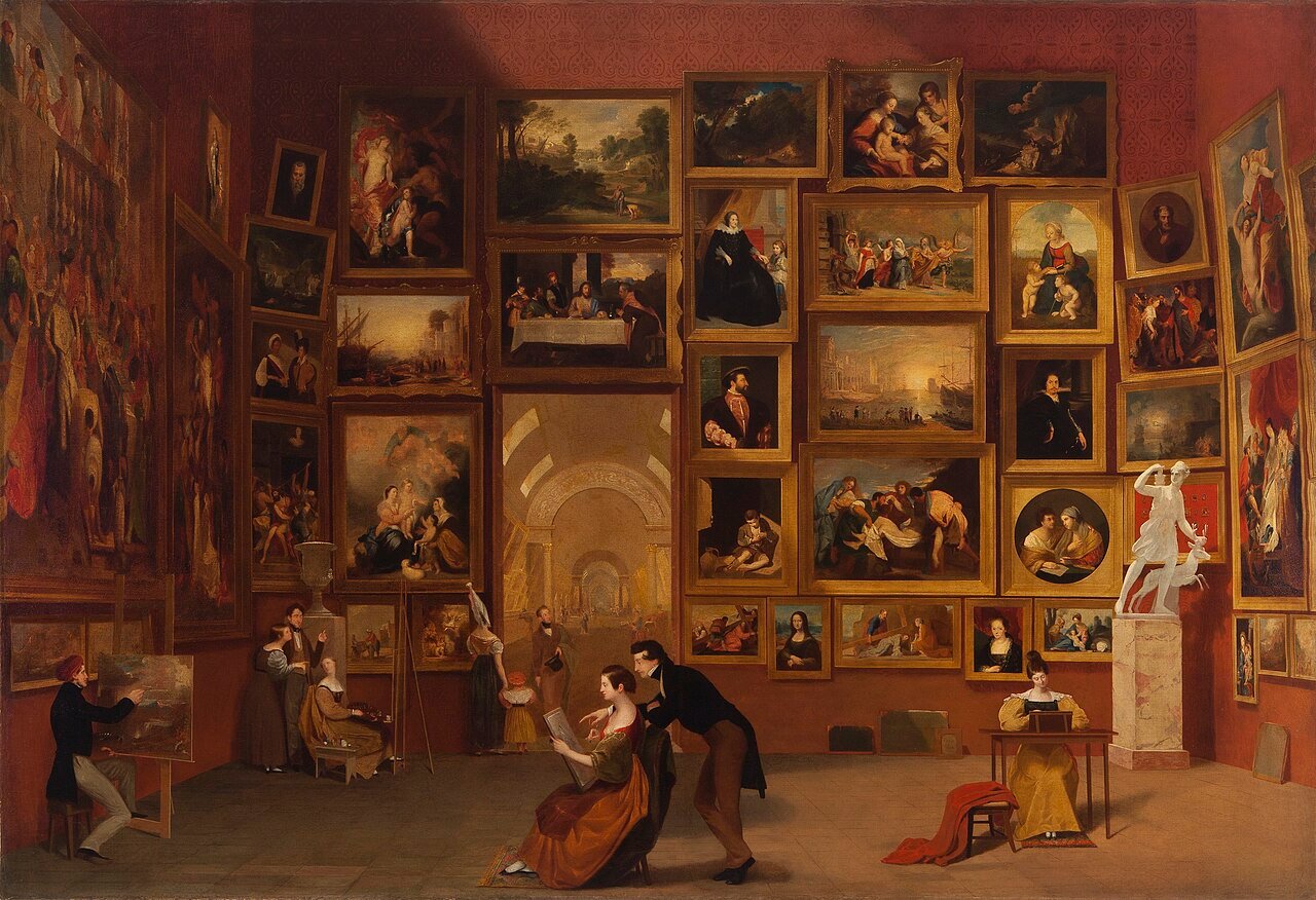
In 1998, two researchers stood in the galleries of the Metropolitan Museum of Art with a stopwatch. They timed 150 visitors looking at six masterpieces. The number they published three years later still unsettles museum professionals: the median visitor spent 17 seconds in front of a painting. The average was 27.2 seconds, dragged upward by a handful of long lookers. The longest stop lasted three minutes and forty-eight seconds. One person stood that long before Rembrandt’s Aristotle with a Bust of Homer.
Jeffrey and Lisa Smith framed their study around the paradox this creates. People describe paintings as life-changing. They cry in front of them. They remember them for decades. How can anyone be moved that deeply by something they looked at for so little time?
The question turned out to be a good one. It forced a different one: what is the brain actually doing during those seventeen seconds? Over the past two decades, neuroscientists have put people in scanners and tried to find out. The results are more interesting, and considerably messier, than the headlines suggest.
Beauty has an address, and it is smaller than you would expect
The most-cited finding in the field comes from Semir Zeki’s laboratory at University College London. In a 2011 study, Zeki and Tomohiro Ishizu recruited 21 volunteers from deliberately mixed backgrounds. The group included western Europeans, Japanese, Chinese, Indian and American participants. Each rated 60 paintings and 60 pieces of music as beautiful, ugly, or neither. Then the researchers put them in an fMRI scanner and showed them the same material again.
One region tracked the ratings across both senses: the medial orbitofrontal cortex. This patch of tissue behind the eyes also lights up for food, money and other rewards. Beautiful music and beautiful paintings produced activity in the same place. Kawabata and Zeki had already linked beauty in paintings to that region in 2004.
Two details from the 2011 study get quoted far less often than they should. First, ugliness did not behave as beauty’s mirror image. It recruited the amygdala and the somatomotor cortex instead. The brain seems to evaluate “this repels me” by a different route than “this attracts me”. Second, and most tellingly, the works that participants rated as merely indifferent produced almost nothing at all. Indifference, neurologically speaking, is not a weak version of appreciation. It is closer to an absence.
The finding that complicates all of this
Here is where an honest account has to slow down.
In 2020, a meta-analysis pooled the imaging studies on visual beauty. It appeared in Cognitive, Affective, & Behavioral Neuroscience, and it hunted for regions that showed up reliably across them. Beautiful faces produced a consistent signature: the ventromedial prefrontal cortex and the ventral striatum. Beautiful artworks produced no surviving clusters at all, even after the authors loosened their inclusion criteria. The two kinds of visual beauty shared no common ground.
This does not mean Zeki was wrong. It means the effect cannot survive being averaged across dozens of laboratories. Those labs used different paintings, different instructions and different participants. That is itself informative. Responses to art may be far more individual than responses to faces, and averaging people together may be the wrong analytical move entirely.
That hint turns out to be the most productive idea in the field.
Why the same painting does not move everyone
In 2012, Edward Vessel, Gabrielle Starr and Nava Rubin ran a study at New York University. It took individual variation seriously rather than treating it as noise. Participants rated artworks on a four-point scale in the scanner. In the visual areas, activity rose smoothly with the ratings, exactly as you would expect. A three produced more than a two, a two more than a one.
But one set of regions behaved completely differently. They ignored the ones, twos and threes almost entirely. Then they jumped sharply for the fours: the works a participant found genuinely moving. It was a step, not a slope. Those regions belonged to the default mode network. That system handles internally directed thought, autobiographical memory, and the sense of self.
This was surprising, because the default mode network normally shuts down when you focus hard on something outside yourself. Looking intently at a painting should suppress it. Instead, for the most moving works, it switched on – while the eyes stayed fixed on something entirely external. Belfi and colleagues refined the picture in 2019. The network appears to lock onto the artwork itself for moving images. For disliked ones it runs independently.
The researchers also noted how little agreement there was between observers about which works deserved a four. There was no consensus masterpiece.
Put those two findings together and you get something worth sitting with. A work of art becomes powerful at a specific moment. The brain stops treating it as an external object and starts using the machinery it normally reserves for thinking about yourself. That is why the experience feels personal rather than detached. It is also why nobody can talk you into loving a painting that leaves you cold.
Painters worked this out first
Some artists reached the same conclusion empirically, centuries before anyone could measure it. Velázquez built Las Meninas around the viewer’s position in the room. Friedrich turned his Wanderer above the Sea of Fog away from us, and the only face the scene offers is our own. Both paintings do by composition what the scanner detected: they make the viewer part of the subject.
Does any of this last?
Scanner studies capture minutes. The more consequential question is whether a lifetime of looking at art changes anything.
Daisy Fancourt and Andrew Steptoe published the largest attempt to answer it in The BMJ in 2019. They followed 6,710 adults aged 50 and over from the English Longitudinal Study of Ageing, starting in 2004–05. They then tracked deaths over fourteen years. Some participants visited museums, galleries, exhibitions, the theatre, concerts or the opera once or twice a year. Their risk of dying during the follow-up was 14% lower than for those who never went. Those who went every few months or more had a 31% lower risk.
The figure survived adjustment for wealth, education, existing illness, mobility, smoking, alcohol, depression and social contact. It did not disappear when the obvious explanations were controlled for.
It is still an observational study, and the authors say so plainly: causality cannot be assumed. Going to galleries may be a marker of something the researchers did not measure. Treat it as a strong association and an open question, not as a prescription.
The World Health Organization’s European office mapped the broader evidence base that same year. The review, by Fancourt and Saoirse Finn, covered more than 900 publications. Those included over 200 reviews drawing on more than 3,000 studies. It remains the most comprehensive survey of arts and health to date. Its conclusion is neither dismissive nor breathless: the arts play a genuine role in preventing illness and in managing it, across a whole life.
What the research does not show
This field attracts more confident claims than its evidence supports. Four are worth correcting.
Mozart does not make you smarter
The 1993 study behind this idea found a brief improvement on a spatial reasoning task in college students. It did not involve babies, and it did not measure intelligence. In 2010, Pietschnig, Voracek and Formann meta-analysed roughly 40 studies covering more than 3,000 participants. They found no support for a specific Mozart effect. Whatever small effect existed appeared with other stimulating music too. A 2023 meta-analysis by Oberleiter and Pietschnig examined the claim that the sonata KV 448 helps with epilepsy. They found no meaningful support for that either. The authors were blunt about the causes: underpowered studies, unavailable raw data, and repetition of an authoritative-sounding claim.
There is no artistic right hemisphere
One half of the brain supposedly holds creativity, the other logic. That idea survives in popular writing and nowhere else. Every imaging study described here found distributed activity across both hemispheres.
Mirror neurons are a hypothesis, not an explanation
In 2007, art historian David Freedberg and neuroscientist Vittorio Gallese published a proposal in Trends in Cognitive Sciences. Part of our response to art, they argued, involves embodied simulation. Seeing a depicted gesture, or even the trace of a brushstroke, activates the observer’s own motor systems. It is a serious and productive idea. Researchers have contested it since publication, arguing that simulation cannot carry the explanatory weight placed on it. Anyone who tells you mirror neurons explain why art moves us is skipping the argument.
Michelangelo probably did not hide a brain in the Sistine Chapel
In The Creation of Adam, the red cloak surrounding God supposedly traces the outline of a human brain. People have repeated this claim for decades. The resemblance is genuinely striking, and the argument is a legitimate one. But it is an interpretation offered in 1990, not a documented intention, and no contemporary source supports it. Worth knowing, worth enjoying, not worth stating as fact.
Back to the seventeen seconds
The Smiths repeated their study at the Art Institute of Chicago fifteen years later. They used a bigger sample and more varied works. The median rose to 21 seconds. Smartphones, it turns out, did not ruin anything – people were already moving quickly in 1998.
What did change the numbers was company. Both studies found no effect of age or gender. Group size mattered: people looking together looked longer. A study of Gerhard Richter paintings by Claus-Christian Carbon found something the stopwatch studies had missed. Roughly half of visitors came back to a work later in their visit. Those return trips added time nobody was counting.
So the paradox has a resolution, and it is not the flattering one about hidden depths of instant perception. Seventeen seconds is what an unmoving painting gets. The works that reach the default mode network get returned to, talked about, and remembered. They are different works for different people. That is why the meta-analysis found no shared address for beauty in art.
The practical implication is almost embarrassingly simple. If you want more from a museum, see fewer things and go with someone. The neuroscience of art appreciation, after two decades of scanners, mostly recommends slowing down.
Works worth more than seventeen seconds
If the research says anything usable, it is that the works which reach you are the ones you return to. Here are six from our archive that reward a second look, and a reason for each.
- The Starry Night – almost everyone recognises it. That makes it a good test of whether recognition and being moved are the same thing. They are not.
- The Kiss – Klimt chose gold leaf for how it behaves under moving light. A reproduction cannot give you the effect the painting was built around.
- Mona Lisa – the most photographed and least looked-at painting in the world. Nothing shows better what a crowd does to attention.
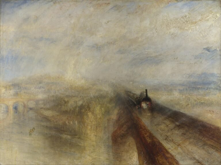
- Rain, Steam and Speed – Turner painted motion when almost nobody had experienced it at speed. The subject is perception itself.
- The Last Supper – it has been deteriorating since Leonardo finished it. That raises an awkward question about what people travel to see.
- The Scream – Munch was painting a sensation, not a scene. The figure is not screaming; it is hearing one.

16 Comments